

Blog . Microsoft Updates Their "Bing" Logo
Blog
Microsoft Updates Their "Bing" Logo
09/26/16 | Posted by Eric Burton | Posted in Digital Creativity
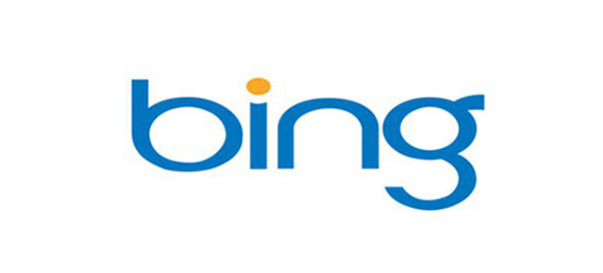
For far too many, including renowned type designer, Erik Spiekermann, the logo Bing launched with back in 2009 was a total design nightmare. And I agree one hundred-ten percent. Now I know the word “bad” is an unprofessional description, but the logo was—BAD.
Okay I’ll fix that. The logo wasn’t favored, because it looked and felt incoherent to Microsoft’s branding. Moreover, the colors and typeface were soft in comparison to Microsoft’s trademark Helvetica-esque Sans Serif; the kinds of mistake you want to avoid especially with brand extension and the launch of a new product. Mistakes like that can destroy your brand, but since this is about the logo, we won’t touch on that subject.
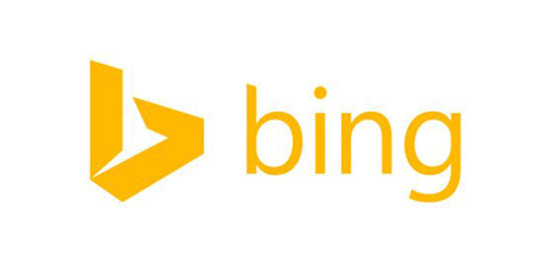
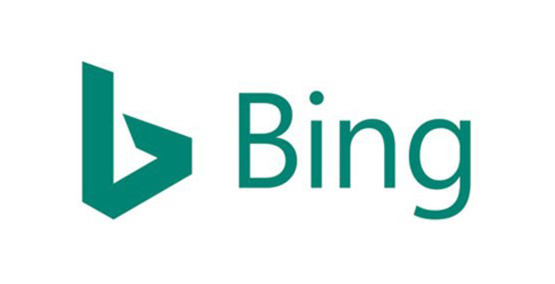
There have been two logo changes since the “Bing” search engine launched. The 2013 update was progressively better, and I’d say, Microsoft nailed it with Bing’s 2016 logo refresh. There are two elements in the new design I want to discuss, the logo mark and the word mark.
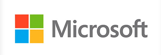
At first glance, changes feel far and few, but that’s what good design does; it makes the necessary changes only. So for this logo refresh, the designer took careful consideration coinciding Bing’s look and feel to Microsoft’s 2012 brand re-launch. The reason this works is that the logo now sits in centerfield. It doesn’t antagonize and certainly fits the new “approachable” look Microsoft took on with the launch of Windows 8.
Since the release of the 2009 version, the logo has apparently gained a logo mark, the flat “b” shape, which mimics icons we are now familiar with from most IOS systems. The addition of this element adds dimension not seen previously, because the logo mark can be used in conjunction with the new Microsoft Edge icon and also characteristically with the Microsoft Office icons.
To achieve this, the designer chose to tighten up the logo mark by reducing its horizontal width and removing the “slit” in the “b”. There is a slight adjustment in the mark’s height, which creates a very pleasant eye line that moves in the direction of the word mark. This choice works really well, because the logo mark no longer looks skewed or disproportioned; it reflects the shape of the lower case “b” in Microsoft’s new choice in typeface.
For the word mark, the only apparent change is the move from a lower case “b” to a capital “B”. This doesn’t feel significant, but take a look at Microsoft’s new corporate logo then you’ll understand why the designer made this one simple decision.
QUICK TIP: Change is less about vision and more about perception. Don’t be swayed to move a design in a visual direction that’s too far away from its origin. The initial Bing logo would have and could have been successful in another place or time. The idea is behind concept and precept.
-
Comments
0

- Tweet