
Blog . How to Create a Skate Park Poster in Adobe Illustrator
Blog
How to Create a Skate Park Poster in Adobe Illustrator
01/14/15 | Posted by | Posted in Digital Creativity
I learned how to balance, move, and not wear my favorite pair of jeans on a skateboard. When I was living on campus while attending CIA, I saw more and more people getting around on a longboard. I bought my first Earthwing longboard last summer and loved it just as much as my skateboard. One of my favorite documentaries about skateboarding is Dogtown and Z-Boys. The film is directed by Stacy Peralta, to tell the story of the emergence of the Zephyr Skateboarding team. Stacy is an original member of the group who tells the story of a group of teenagers from dysfunctional families who laid the foundation of skateboarding. Both skateboarding and longboarding were influenced by surfing, it was invented because surfers in California wanted something to do when there weren't any waves. Longboarding appeals to people who aren't trick-savvy, making some skateboarders prejudiced against longboarders.
My new longboard investment and admiration for the film Dogtown and Z-Boys inspired me to create a skate park poster. Typography, or "the study of text," is a perfect opportunity to showcase some of the new features in Adobe Illustrator CC.
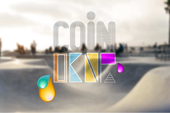
I started with the typography and added a background and details last. I used offset paths to design the word "coin." The offset path command will work on any path, it doesn't have to be type. This is a quick way to duplicate instances of a design and be able to customize the spacing and corner appearance. For each letter I used the menu at the top Object > Path > Offset Path. You can preview the results, I repeated this to get a thumbprint look for my font.
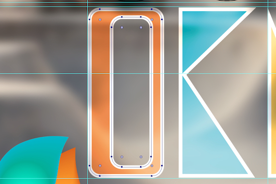
For the word "drop" I used the pen tool to create my own letters. I wanted a modern block style with bright colors. This is where I used one of the new features called Live Rectangles. All rectangles and rounded rectangles have corner widgets, which will show a preview of the transformation when modifying the shape. This helped me form the shape of the text faster.
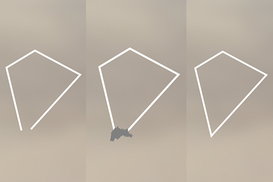
Another new feature is the Join Tool, I like to call it the shape cleaner. If your paths don't close completely for a fill, this tool allows you to scrub over the points you want to connect with a paintbrush to form a complete path. Once all of my block letters were filled with my color, I turned the opacity down to let the background subtly show through the letters.
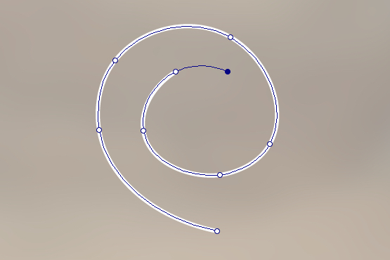
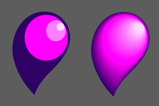
I added droplets using the Blend Tool. I made a teardrop shape with a new feature called the Curvature Tool. This tool makes shape building a lot less daunting because it shows a preview of what the curve will look like when plotting points. If you want a straight line instead of a curved, just press Option/Alt on the keyboard when dropping a point.
I made ellipses of color where I wanted the shading to happen. I grabbed the Blend Tool and changed the blend options to "smooth color" by going to Object > Blend > Blend Options. I clicked on my darkest colored shape first, and clicked on the next lighter color, and so on.
The last addition was my background image of a skate park to which I added a Gaussian Blur to not distract from my typography.
-
Comments
0

- Tweet