
Blog . Urban Nature
Blog
11/21/13 | Posted by | Posted in Digital Creativity


Build a Stash
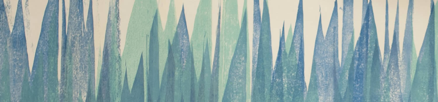
University Circle is orange, gold, and red with the leaves changing color, so I went on a photography adventure! I have a collection of macro photos of colors and textures I like to use in projects. For digital paintings and 3D models my stash has come in handy to make my images more believable.
Urban Nature
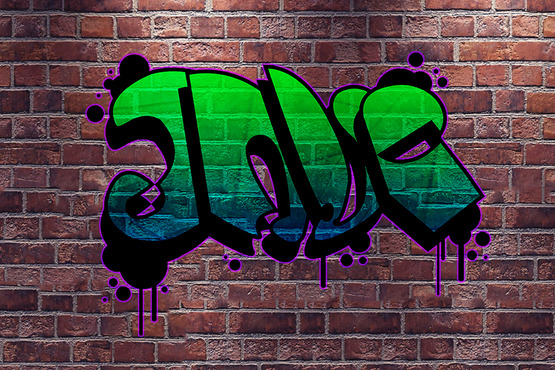
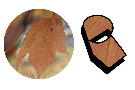
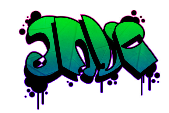
I like the idea of mixing elements of city life and nature. The struggle for one to overtake the other is never-ending, but in my design they work together. I made a graffiti-style logo inspired by one of the images I took of a leaf. The intricate veins of the leaf provided organic contrast to the tag lettering.
Clip and Merge
I worked in Adobe Photoshop using the pen tool to draw out my letters on separate layers. There wasn't any rhyme or reason to it, I created abstract shapes that could resemble letters in a solid color so that I can use them as a clipping mask. I overlayed a green and blue gradient to compliment my leaf texture and clipped to my letter shapes. I had to duplicate a the texture and gradient for each letter. Merging layers will be necessary each time a new element is clipped, make sure to save several versions of the file to be able to go backwards and revise. As I got close to finishing, I realized I need to go back into the file to duplicate my letter shapes and offset for the shadow, saving as a different file saved me!
Splatter and Drip
I used a hard-edged round brush to create the paint splatters and drips behind my logo. To give it a halo effect, I again merged all of my individual layers into one so that I could double-click the layer and give it an outer glow. In my workflow I always save refining details as the last step.
Set the Scene
With all of my layers merged so that my logo can be exported as a PNG with no background, I imported the file onto a brick background to set the scene. I adjusted the color balance of the brick wall to have more blue undertones to match the cool colors of my design. I set the blending mode of my logo to "hard light" to make it look like it was painted on the wall. When artist's block hits, go outside and be inspired!
-
Comments
0

- Tweet